
The McCarthy
Family Reunion
Brand guidelines for the reunion and the rules that hold it all together.
A short book about how we look, so we keep looking like ourselves.
The McCarthys gather every five years. Between gatherings, the family lives in a hundred inboxes and group chats and group photographs taped to kitchen cabinets. This document exists so that whatever any of us puts the family name on (a website, an invitation, a tote bag, a slideshow at the banquet on Saturday night) feels recognizably ours.
It is intentionally short. The crest is the brand; the green is the brand; the type is the brand; the way we write to one another is the brand. Hold those four things and you can't really go wrong.
What's inside
- 01The Crest master mark, lockups, clear space, and what not to do
- 02Color the forest palettebrand green, the full scale, neutrals, accents, and how to mix them
- 03TypographyFraunces, Cardo, UnifrakturCook and the moments each is for
- 04Voice & tonewarm, plain, slightly elevated: what to write and what not to write
- 05Foundationsspacing, radii, shadows: the quiet rules
- 06In the Worldinvitations, stationery, social, merch
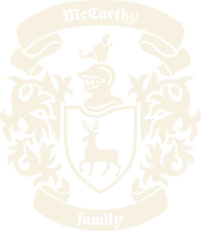
A knight's helm above a shield bearing a rampant stag, with the family motto on a scrolling banner: forti et fideli nihil difficile.
A crest, not a logo.
The McCarthy coat of arms is the family's mark. Treat it as inherited, not invented, like a signet ring, not a corporate identity.
It is permitted, occasionally, to use only the helm and shield; this is the icon, reserved for small contexts where the full crest would lose its detail. Below 48 pixels tall, default to the favicon: the forest green UnifrakturCook M on parchment.
The crest is never radius-clipped, dropped into a circle "logo cookie", or set inside a rounded badge. It carries its own silhouette.
For ceremony: invitations, the website hero, the title slide on Saturday night, the back of the program.
Six approved lockups, one job each.
There is no "make it pop" version. Pick the lockup whose colorway and silhouette belongs on the surface you're putting it on.

Give it the height of the helm.
Always preserve clear space equal to the height of the helm on all four sides. Nothing (not type, not photography, not another logo) crosses that boundary.
The dashed gold rule shows the minimum keep-out. The crest may sit further inside; never closer.
| Surface | Minimum height |
|---|---|
| Full crest | 96 px / 24 mm |
| Icon (helm + shield) | 32 px / 8 mm |
| Favicon | 16 px / use as-is |
Eight things never to do to the crest.
If you find yourself doing any of these to "make it work," the surface is the problem, not the crest. Resize it, move it, or use the icon instead.
forti et fideli nihil difficile
to the brave and faithful, nothing is difficult.
Anchored on the forest green sampled directly from the crest, the palette runs from a near-black bog green down to a faint parchment-green wash. Neutrals are warm, never cool grey.
A palette built around one good green.
The whole system orbits a single hex: #0B3D1E, sampled from the heart of the crest, named simply McCarthy Forest.
Pair greens with parchment and bone, never with cool grey. Reach for the heraldic gilt as a rule, an ornament, a numeral. Sealing-wax red is reserved for true emphasis: errors, "RSVP closed," funeral notices.
The full scale of greens.
Use the scale, not arbitrary in-betweens. Each step has a job.
Neutrals parchment, bone, ink
Warm only. Parchment is the page; bone and cream are surfaces; ink is type.
Accents gilt & sealing wax
Used sparingly. Gilt for rules, numerals, etc. Wax red for true emphasis only.
Roughly how much of each, on a typical page.
Parchment leads. Forest green carries the section bands and headers. Forest green carries the marks and the buttons. Gilt is the seasoning. Wax red barely appears.
Three approved pairings.
Each is a legitimate "skin" for any surface: invitation, web, slide, post.
Old-style serif for headings, humanist serif for body, blackletter for ceremony. Spacing is editorial; line lengths sit between forty and seventy characters.
Type that feels carved, not generated.
Heritage typography means letterforms that look as if they had a hand in them. The system uses three families and reserves one for ceremony.
0123456789
Reserved exclusively for the McCarthy wordmark on the crest banners, the occasional decorative drop-cap, and the title of an invitation set in deep ceremony. Never run blackletter as body type. Never recreate the wordmark by hand; use the artwork.
0123456789 & Æ Ø ç é ß italic
Fraunces is set with optical-size and SOFT axes wide open at display sizes (opsz 144, SOFT 70). The italic carries the warmth; use it whenever a heading would otherwise feel formal or cold.
Always uppercase. Always tracked at letter-spacing: 0.18–0.32em depending on size. Used for eyebrows above headings, navigation, button labels, table headers, and form labels.
0123456789 & Æ Ø ç é ß italic
A modular scale at 1.2.
Editorial, not aggressive. Every step earns its place.
Three pairings, played in conversation.
The three families almost never appear alone; they speak to one another.
A weekend held together by twenty-five years of practice.
The modern McCarthy family is an American one, scattered across the states and gathered together every five years. The ancient name Carthann signifies "kindness," and that is the inheritance we pass down: a household held together by warmth, plain speech, and the practice of showing up for one another. Patrick Francis McCarthy, called Paddy, married Mary Ann Cecelia Buggy, called Mame, on February 22, 1896, beginning the family from which we all descend.
forti et fideli nihil difficile.
The family motto. Set in lowercase; italicize fully when displayed as a unit, or leave one half plain when used as a visual pairing. Never translate inline—the translation belongs in a footnote or tooltip.
McCarthy
Family reunion · est. 2002 · sixth gathering
Warm, plain, slightly elevated. The way you'd write a letter that gets framed, not a tweet.
A letter that gets framed.
We use "we" when speaking as the family collectively (we gather every five years) and "you" when speaking to a guest (please RSVP by July 1). Avoid corporate "the McCarthys" third-person distance.
Short, declarative sentences. One idea per paragraph. Lists are fine for itineraries; prose is better for invitations and history.
How we'd phrase it · how we wouldn't.
"Three days in the green, every five years."
A simple promise. Names the thing, the cadence, the place, without leaning on adjectives.
"An unforgettable five-year journey of family connection & togetherness!"
Marketing voice. Adjective stacking. The exclamation point and the ampersand both work against the heritage feel.
"You're on the list. We'll see you at the reunion."
Confirmation in eight words. Warm, specific, present-tense.
"Your registration has been successfully submitted to the McCarthy Family Reunion system."
Passive voice. "System". Distance where there should be welcome.
"Please RSVP by July 1."
A direct request to a person you respect. Names the deadline and stops.
"Click here to sign up now & secure your spot!"
Webinar voice. "Click here" never names what's on the other side.
A small vocabulary we share.
Family words. Use them as proper nouns where the family does.
Mechanics casing, dates, motto, numbers
| Element | We do | We don't |
|---|---|---|
| Headings | Title Case for short: The Reunion Sentence case for long: What to bring on Saturday | ALL CAPS · sentence-case short titles · Title-Cased Microcopy |
| Dates · invitations | Saturday, July 11, 2026 | 7/11/26 · Sat 7-11-26 · 11 July '26 |
| Dates · itineraries | Sat 11 Jul · 6:30 pm | 2026-07-11T18:30 |
| Latin motto | Lowercase: forti et fideli nihil difficile Italicize fully, or split italic/plain for emphasis Translation in tooltip or footnote | "forti et fideli (To the brave and faithful!)" |
| Numbers | Spell out small (seven cousins) Numerals for larger counts and dates (412 attending) | "7 cousins" · "four hundred and twelve" |
| Pronouns | We as the family · you as the guest | "The McCarthys are pleased to announce…" |
| Emoji | Stag · sparing use | 🎉 🍀 🇮🇪 ☘️ |
| Calls to action | RSVP by July 1 · Open the Green Book | Click here · Sign up now · Learn more |
Spacing on an 8-point base, document-like 2-pixel radii, warm green-tinted shadows.
Hard, intentional edges.
Heritage-brand things prefer hard edges. We use a single 2-pixel radius for almost everything, with pill reserved for chips and avatars only. The crest itself is never radius-clipped.
Spacing an 8-point grid
Generous vertical rhythm. Hero sections breathe at 96–128 px top/bottom; cards pad at 24–32 px.
Radii document-like
Singular 2 px for all surfaces, except pill for chips and avatars.
Shadows paper on paper
Warm, green-tinted, never neutral grey. Three steps.
A small set of finished surfaces, to show how the rules above land in the wild: invitation, postcard, stationery, social, merch.
What it looks like, in the wild.
If a surface ends up in a McCarthy's hand, it should feel like a thing they want to keep, not a thing they want to recycle.
The Sixth McCarthy
Family Reunion
July 16–18, 2027 · Ellicott City, Maryland
Family Reunion
Est. 1875
the family
forti et fideli,
nihil difficile.
Hold the crest, the green, the type, and the way we write to one another, and you can't really go wrong.